From a winery led by three generations comes Preiner III – a premium cuvée made of three varieties, some of them unique to the winery’s micro-location. Heritage, quality, and elegance – those are the three value pillars of Preiner Wines, and all of them are embodied in this wine and its label.
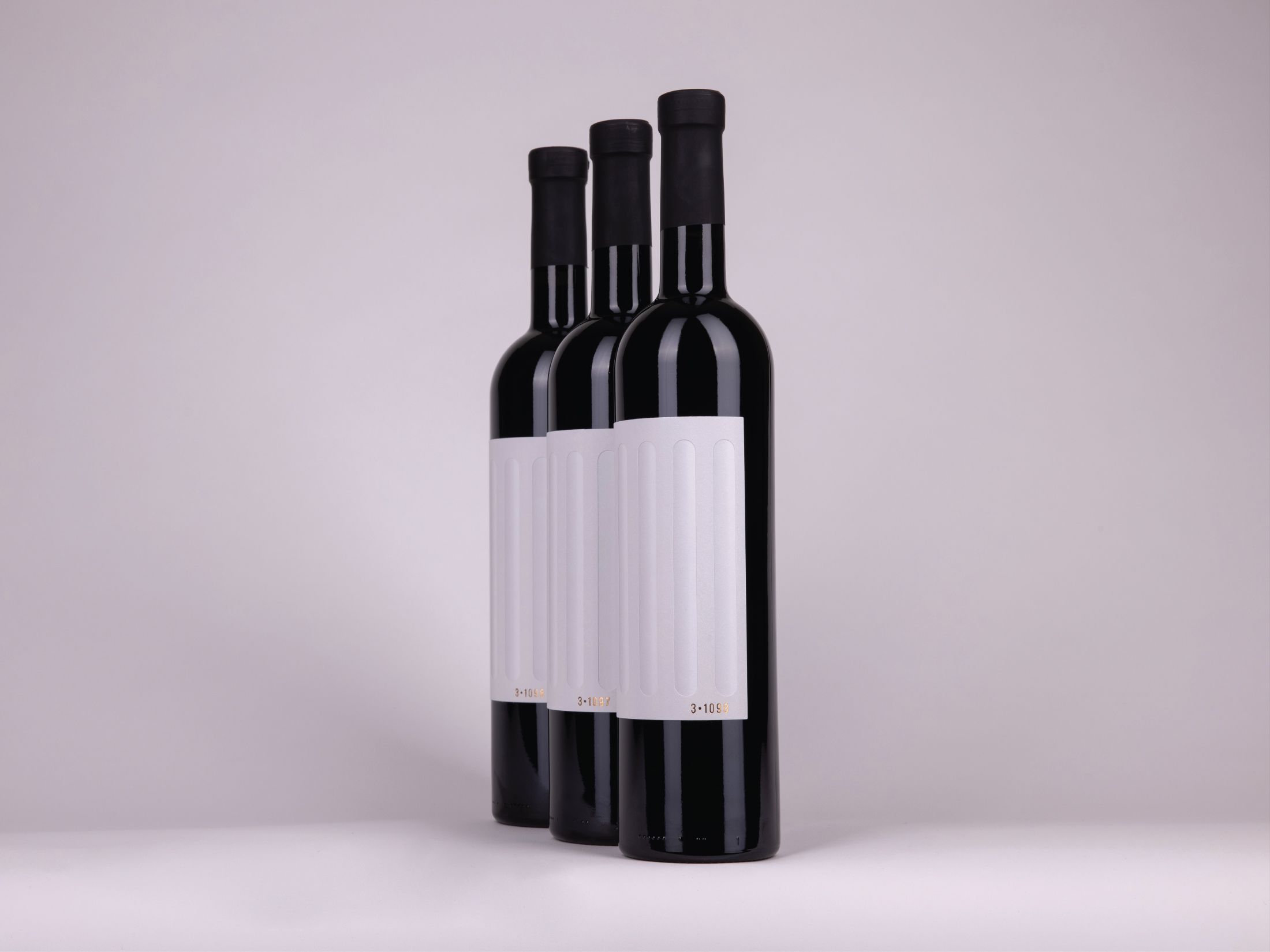
The goal was clean elegance that speaks louder than words, so the idea that design is only complete when there is nothing left to remove guided Leon K. Studio as they created this label.
Since Preiner’s visual identity incorporates elements of classical architecture, we used them for III as well: two precisely superimposed papers recreate the structure and dimensionality of a fluted column. The only graphic element on the label is numeration – each bottle has a unique number obtained by debossed bronze foil that seems like it was carved in stone.
The result? Technically demanding yet outwardly simple label for a complex wine that turns a bottle into a classical pillar.


