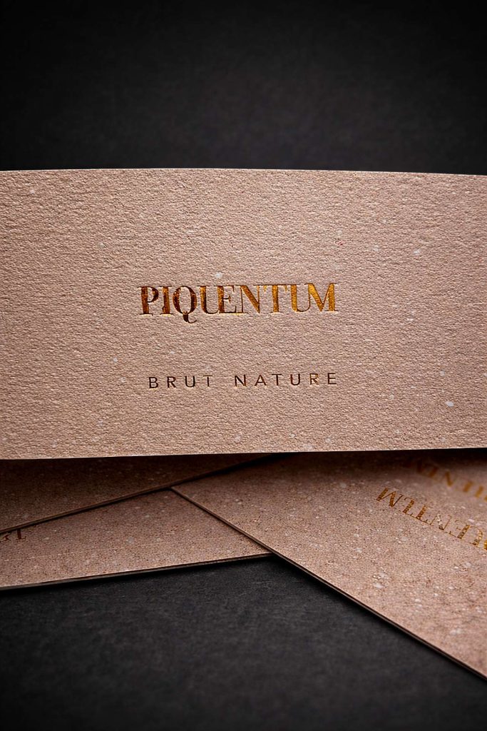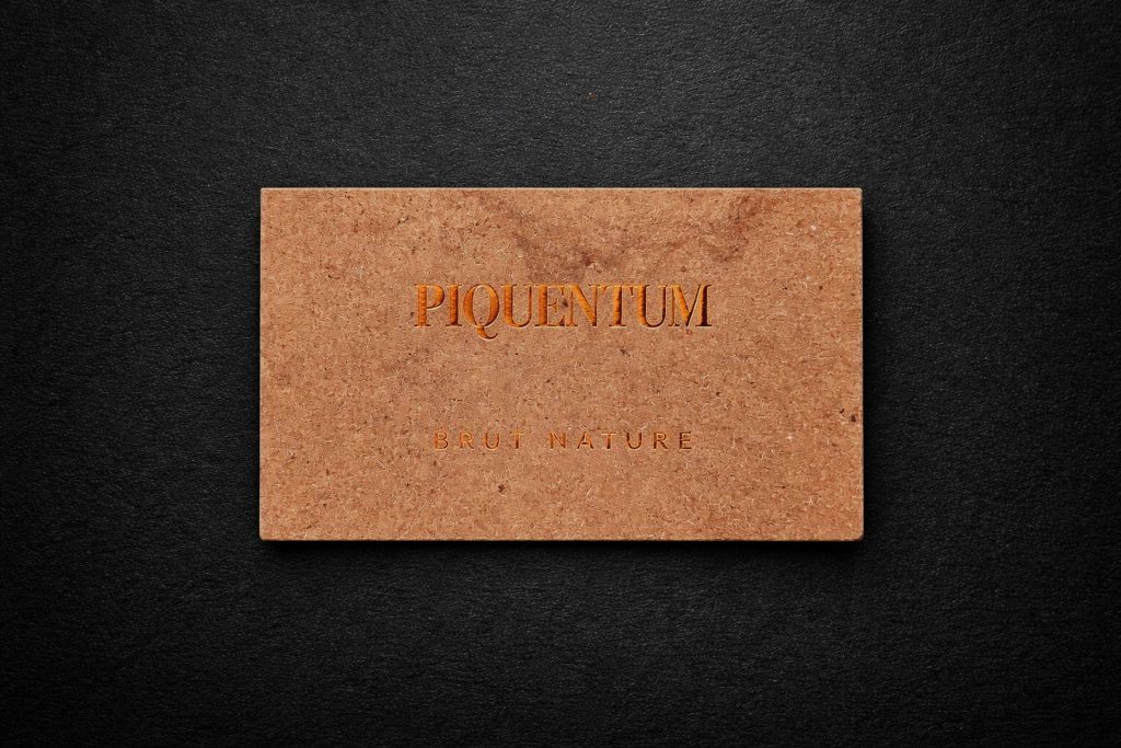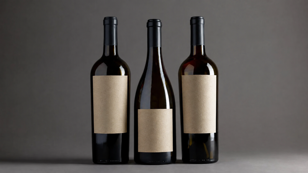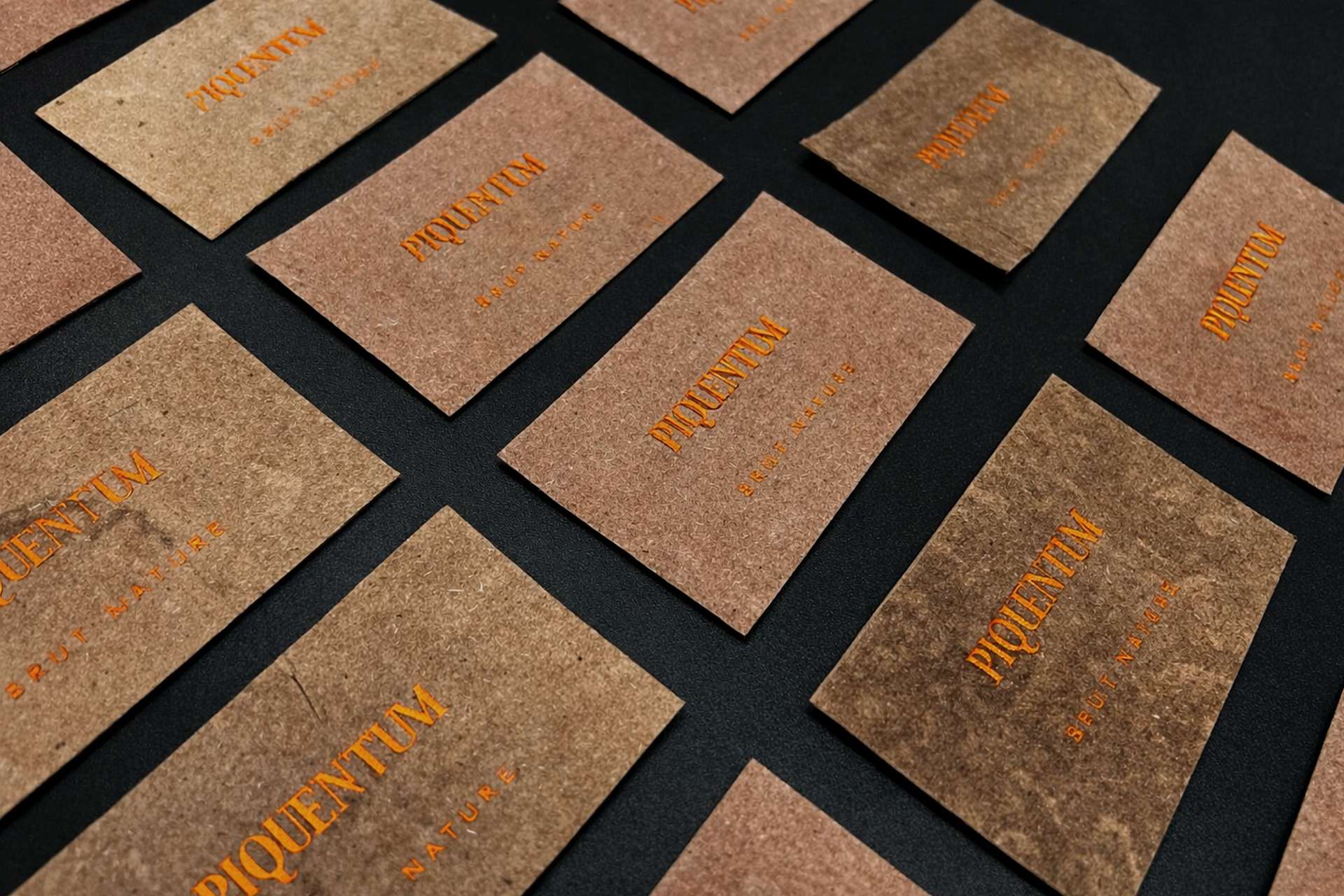
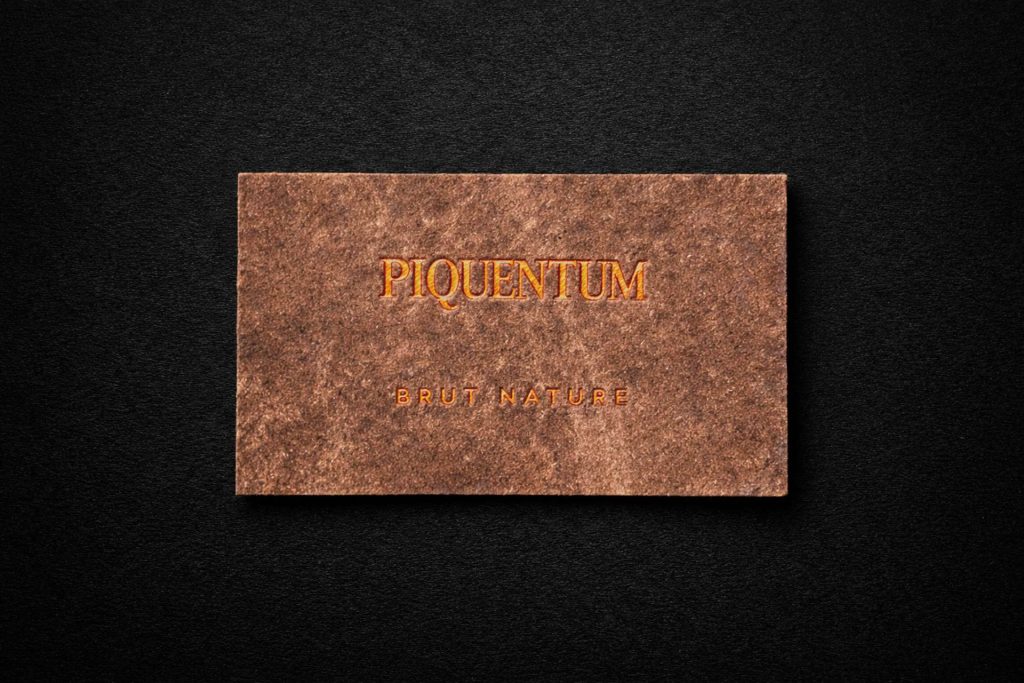
In the world of wine labels, it is rare for material, process and idea to truly become one. Even rarer is a label that does not merely represent the wine, but is literally created from it. This is exactly what happened with the label for Piquentum Brut Nature, designed by the studio Sonda. Conceived as a living Manifest of Non Compromise, the label uses a natural by product of winemaking as its ultimate proof.
Building on a long and successful collaboration on complex, high end projects that continuously push the boundaries of what is possible, Piquentum and Sonda once again chose Etikgraf as their production partner for another seemingly impossible label.
The Piquentum Brut Nature label is not the result of a conventional graphic design process focused on choosing paper, colour and finishing. It emerged from a radical decision to start at the very source of the product. From the wine itself.
A design concept that begins in the cellar
The starting point of the project was the philosophy of Piquentum winery. One hundred percent organic wines and sparkling wines, without additives, corrections or compromise. Studio Sonda recognised that such a sparkling wine could not carry a conventional label. Instead, they decided to produce the label from what naturally occurs during the production of sparkling wine.
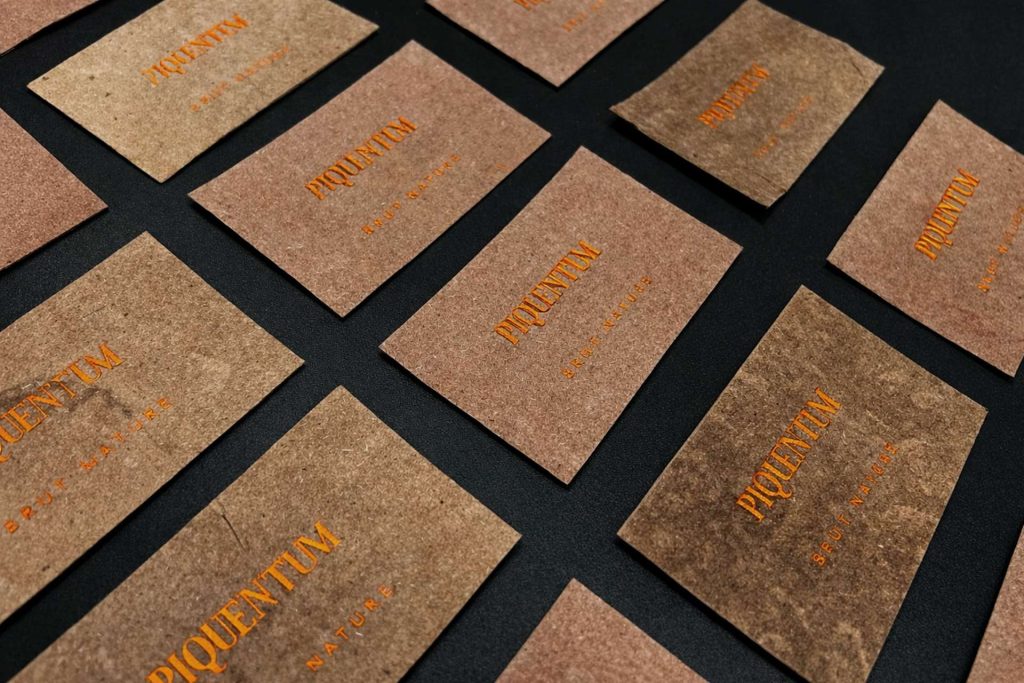
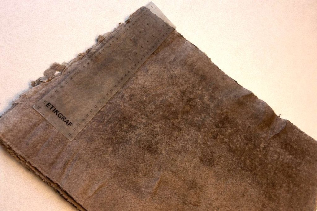
Yeast sediment, a by product of secondary fermentation, was collected and combined with paper fibres, including ten percent paper pulp derived from the winemaker’s notes, cardboard packaging and similar paper waste. The result was an organic material from which the labels were handmade. Each label is different, unpredictable and subject to change over time. Just like the wine.
Where design ends and production begins
While the idea is powerful in theory, in practice it raises a series of very specific production challenges. The material created from yeast sediment and paper fibres does not behave like industrial paper. It varies in thickness, structure and strength, is sensitive to humidity and reacts to its environment. For this reason, it could not simply be integrated into standard production processes.
Producing the label required adapting every step. From cutting and formatting, through selecting the appropriate adhesive, to the application on the bottle itself. Some solutions proved unusable already during testing. In certain cases the material detached, in others it lacked sufficient stability or lost the desired properties.
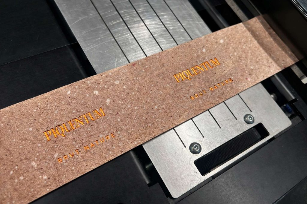
At this point, Etikgraf’s role became crucial. Not as a technical executor, but as a partner seeking solutions outside standard production workflows and taking responsibility for bringing the idea to completion, rather than leaving it at the concept stage. The goal was not to adapt the design to production, but to develop a production process that would respect the design concept.
This included cutting an extremely delicate and uneven material, adapting finishing processes and applying hot foil stamping that had to function on an organic, non standard surface. A combination of machine based and manual procedures, numerous tool adjustments and continuous communication with the design team were essential in order to achieve a stable and repeatable result without losing the character of the material.
The result is a label that can be safely applied to the bottle exclusively by hand, while retaining its organic, imperfect nature. This project would not have been possible without the expertise and commitment of many colleagues and partners involved in this demanding process. The true value of the project lies precisely in this balance between control and allowing the material to express itself.
A label as proof
The Piquentum Brut Nature label is not merely a visual identifier. It is a label that confirms what the wine truly is, without concealment or embellishment. It reacts to its environment and to time. Over the years, it may show changes in colour, texture and subtle traces of the process in which it was created. It is not perfect, and that is exactly its message.
The collaboration between Piquentum winery, studio Sonda and Etikgraf has developed over many years through a series of projects that consistently push the boundaries of what a label can be. It is a partnership in which design does not end on paper, and production does not begin with a finished solution. Instead, ideas are jointly developed, tested and brought to life. This approach has been recognised well beyond the local context. Projects created through the collaboration between Piquentum and Sonda have received numerous international awards and recognitions, confirming that consistency of vision, courage in design and a willingness to experiment resonate on a global level. More about this collaboration and its continuity can be found in our earlier blog post, Phenomenon Piquentum.
For Etikgraf, projects like this represent a space where production becomes an active interlocutor of design. Projects that push us beyond our comfort zone, demand new solutions, process adaptation and a readiness to take responsibility. When design vision, production expertise and trust between partners act as equal forces, the result is a label that is not merely packaging, but a lasting proof of collaboration and a shared ambition to move the boundaries of the graphic industry further.